Credits
- Web design and development: Damiano Fossa
- Photos: Veronica Fossa
- Icons are provided by Tilda Publishing
Project
What Women Say
Type
Website
Services
Web Development - Web Design

Design and development of What Women Say.
What Women Say is a collection of quotes by extraordinary women. We want to help thought-leaders, keynote speakers, teachers, lecturers, and anyone who wants to be a promoter and a supporter bring a broader set of voices on stage and paper.

What Women Say is a collection of quotes by extraordinary women helping thought-leaders, keynote speakers, teachers, lecturers, and anyone who wants to be a promoter and a supporter bring a broader set of voices on stage and paper.
After collecting several quotes by extraordinary women in a Trello board, we decided to collate them on their site and make it public.
Putting these quotes on their site allowed me to achieve a few goals:
As a result, I stripped back all non-essential pages wherever possible. Aside from the home page, which includes the quotes, all of the other pages are either about, support, or contact. No fluff!
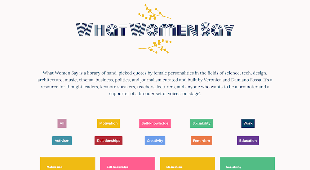
Early on in the design process, we selected the colours and fonts. The two colours making the logo are respectively yellow and denim blue. Yellow refers to the colour of the mimosa flower, a symbolic flower for International Women's Day in Italy. Denim blue is a reference to the working-class women who fought for equal rights.
We picked one colour per category so that the categorization would be clear. We wanted to convey a glamorous feeling, at the same time professional and not too girlish. For example, the colours of "Work" and "Creativity" categories are respectively blue and light blue, which refers to the office environment. "Motivation" and "Feminism" are respectively yellow (the same yellow in the logo) and orange, giving a more vibrant feeling.
The same logic was used to choose the fonts. The serif font used for the body text is called Lora, which is classic and elegant. The sans-serif font selected for headings is Montserrat, which is more playful and modern. A cursive font, Monoton, was used to make the quotation marks and the Category text more diverse. This combination of fonts and colours results make the website looking fresh, glamorous, and joyful.
The site uses CSS Grid for the layout, which encouraged me to experiment with layout options, particularly in the category and quotes list, on the homepage.
UX best practice states that users should expect to see the menu in the same place on each page of a site. I've spent some time thinking about the look of the menu. At first, I placed the navigation bar above the logo, but it was taking too much attention away from the logo. Eventually, I opted for a pop-up sidebar.
The result is a library of quotes by extraordinary women in one place. The quotes are divided into several categories such as Self-knowledge, Activism, Motivation, Education, Work, Sociability, Feminism, Creativity, and Relationship to make navigation easy Each single quote page allows to copy the content with a button, post the content on Twitter, and, if available, access the Wikipedia page of the author.
Logo design by Veronica Fossa.