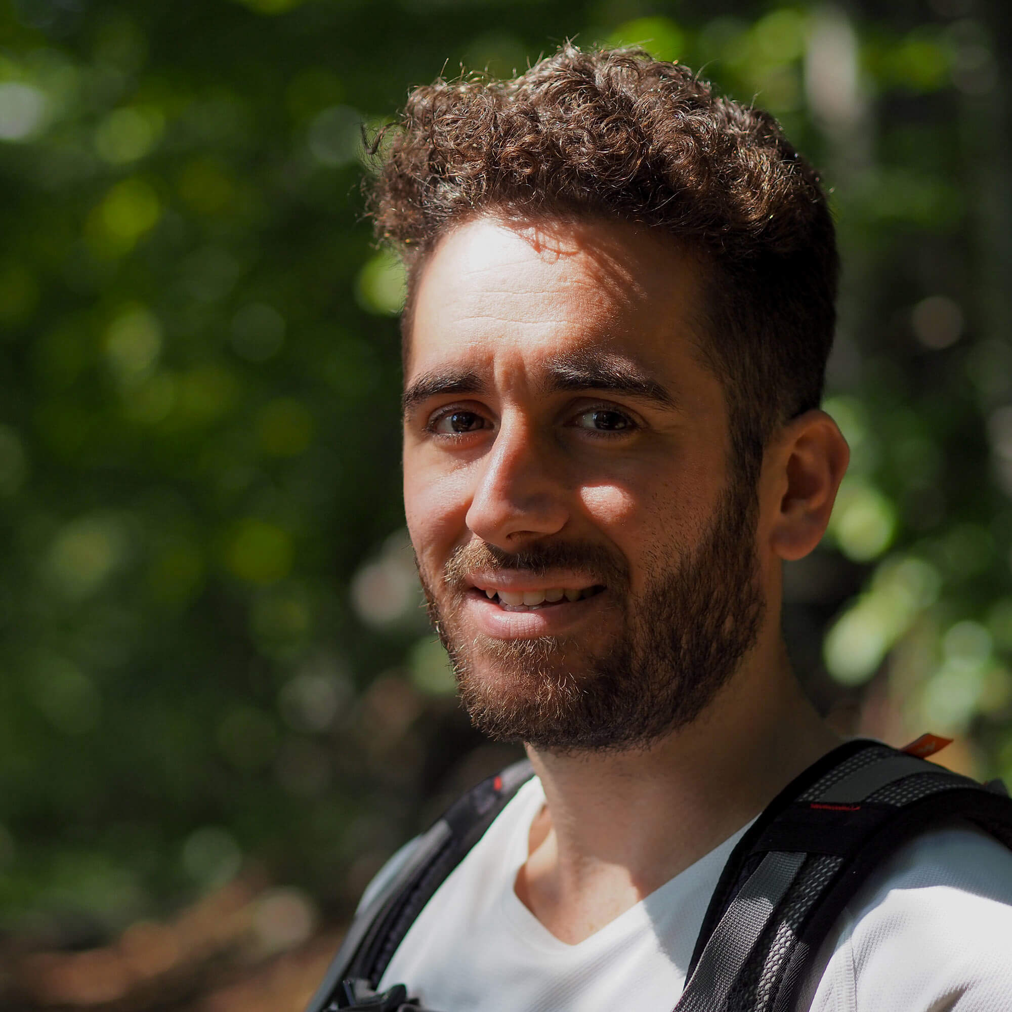
Hi! I’m Damiano,
a front-end developer
I craft solid and scalable front-end products with user-friendly digital experiences.
show me!These projects all started from a few lines of code…
Here’s a selection of my projects and side projects as a full-stack engineer. Do any of these spark your curiosity? Then, let’s discuss them in a conversation anytime!
What Women Say
CTO & Co-founder - React, NodeJS
What Women Say is a library of hand-picked quotes by extraordinary women that brings broader and more equal voices on stage, online, and on paper. As the CTO, I choose the tech stack of the project. I implemented the back-end and API with Node.js and Express. The front-end with React. On the front-end side and with my co-founder Veronica, I created the colour palette and chose the typefaces.
view website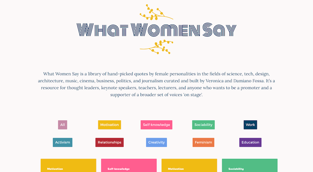
That’s not all! If you’d like to learn more about other projects I’ve worked on but couldn’t feature here, email me to book a call.
"Damiano always delivers top-notch development solutions."
I've often approached Damiano in the last decade, saying, "Hey! I got this and that idea! I have a solution to that problem! How about we create a website/app? And he figures out how to transform your intangible ideas into tangible digital experiences. You always need people like him on your team! Plus, since he has trained in UI, he can design nice and clean interfaces, which I believe is uncommon for developers.
Veronica Fossa
Founder of veronicafossa.com, Co-founder of What Women Say
Damiano takes his time trying to capture what the organisation is about. I got to know him as a reliable person with high professional standards. I recommend him to anyone looking to create or update their website!
Jolien Benjamin
Co-founder & Program Director of Stories On Our Plate
Damiano has always been professional and excellent at planning his time and defining the development scope in the project plans we created together. He always delivers top-notch development solutions. The Foundation is very grateful to have Damiano as our freelance Web Developer.
Craig Kershaw
Former Secretary at EIT Digital Alumni Foundation
Damiano has worked mainly on migrating, planning, and implementing our Alumni website. I like his approach to adequately defining the task and determining the subtasks required to complete the enormous task. He taught me the basics of Drupal, the website migration process, and the complete overview of running a website. I recommend working with him and hiring him as he's a quick learner and a well-organised person in his work.
Shashank Srivastava
Former Technology Officer at EIT Digital Alumni Foundation
Coding on workdays, hiking on weekends
I'm a dedicated Italian front-end developer with over six years of experience. With a back-end development background, I now specialise in front-end development. I work at the European University Foundation, at the IT office in Budapest (Hungary).
Previously as a freelance web developer, I built corporate websites and platforms in WordPress and React for small and medium-sized companies in the hospitality and e-learning industry. I also worked with larger organisations, such as T-Mobile and EIT Digital Alumni.
I love learning new skills. I pay attention to details and constantly seek to be more efficient during project development.
If you're already picturing me as a nerdy dude who wears only black t-shirts and codes all day, I'm sorry to disappoint you! You can often find me hiking in the hills of Budapest, practising yoga outdoors, and sipping a cortado in my neighbourhood (not at the same time!)

Great expertise. Spectacular results.
My main area of experience is front-end development—the client side of web development. I focus on React. I also have full-stack web experience with NodeJS, WordPress, and Drupal.
Visit my Linkedin profile for more details.
NodeJS
React
Figma
WordPress
CSS
Git
Looking for a front-end developer for your project?
Let's discuss how I could craft user-friendly digital experiences for your business.
Project
What Women Say
Type
Website
Services
Web Development - Web Design

Overview
Design and development of What Women Say.
What Women Say is a collection of quotes by extraordinary women. We want to help thought-leaders, keynote speakers, teachers, lecturers, and anyone who wants to be a promoter and a supporter bring a broader set of voices on stage and paper.

The process
What Women Say is a collection of quotes by extraordinary women helping thought-leaders, keynote speakers, teachers, lecturers, and anyone who wants to be a promoter and a supporter bring a broader set of voices on stage and paper.
After collecting several quotes by extraordinary women in a Trello board, we decided to collate them on their site and make it public.
Putting these quotes on their site allowed me to achieve a few goals:
- The quotes would be easier to find and navigate
- It would be easier to categorize them
- The new site would include only quotes by women from my other writing
As a result, I stripped back all non-essential pages wherever possible. Aside from the home page, which includes the quotes, all of the other pages are either about, support, or contact. No fluff!
Early on in the design process, we selected the colours and fonts. The two colours making the logo are respectively yellow and denim blue. Yellow refers to the colour of the mimosa flower, a symbolic flower for International Women's Day in Italy. Denim blue is a reference to the working-class women who fought for equal rights.
We picked one colour per category so that the categorization would be clear. We wanted to convey a glamorous feeling, at the same time professional and not too girlish. For example, the colours of "Work" and "Creativity" categories are respectively blue and light blue, which refers to the office environment. "Motivation" and "Feminism" are respectively yellow (the same yellow in the logo) and orange, giving a more vibrant feeling.
The same logic was used to choose the fonts. The serif font used for the body text is called Lora, which is classic and elegant. The sans-serif font selected for headings is Montserrat, which is more playful and modern. A cursive font, Monoton, was used to make the quotation marks and the Category text more diverse. This combination of fonts and colours results make the website looking fresh, glamorous, and joyful.
The site uses CSS Grid for the layout, which encouraged me to experiment with layout options, particularly in the category and quotes list, on the homepage.
UX best practice states that users should expect to see the menu in the same place on each page of a site. I've spent some time thinking about the look of the menu. At first, I placed the navigation bar above the logo, but it was taking too much attention away from the logo. Eventually, I opted for a pop-up sidebar.
The result is a library of quotes by extraordinary women in one place. The quotes are divided into several categories such as Self-knowledge, Activism, Motivation, Education, Work, Sociability, Feminism, Creativity, and Relationship to make navigation easy Each single quote page allows to copy the content with a button, post the content on Twitter, and, if available, access the Wikipedia page of the author.
Logo design by Veronica Fossa.